Welcome, reader(Dr. Bantang or someone who, for some reason, stumbled upon my blog)! For this post, I wish to document my experience in coding from scratch a simple cellular automata algorithm that models a forest fire.
Cellular automata systems are composed of cells that can be in multiple states depending on the system of choice. These cells can change state according to a set of simple rules. Using these simple, and often local, rules, complex phenomena from the real world may be modeled.
Forest Fire CA description
In this section, I describe the CA algorithm used to model a forest fire.
The forest is modeled as an NxN 2D grid, where each cell can be in any of 3 states: (1) empty land, (2) green tree or (3) burning tree.
The states of the cell are updated per time step based on the following 4 rules.
- A burning tree becomes empty land at the next time step.
- Green trees near a burning tree become burning trees at the next time step.
- A green tree spontaneously combusts into a burning tree with probability f(fire).
- Empty land instantly grows a green tree with probability b(birth)
Forest Fire examples
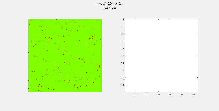
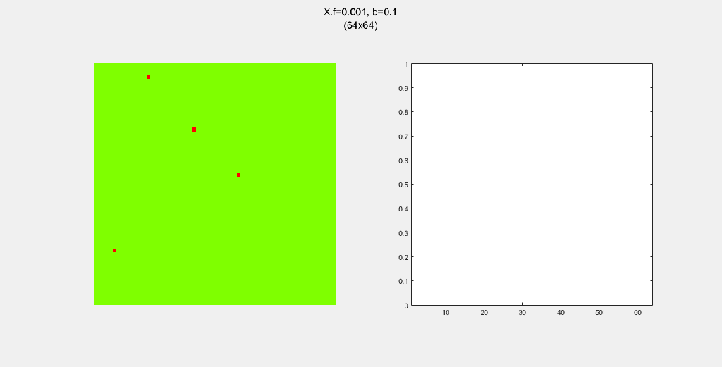
Here are some examples of the forest fire system. I mostly played around with (1) N, the size of the forest, (2) spread pattern, which governs how fire spreads from a burning tree to nearby green trees, (3) f, the probability of spontaneous combustion, and (4) b, the probability of “tree birth”.
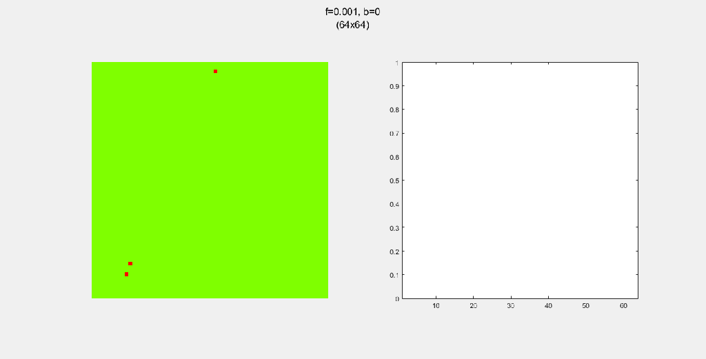
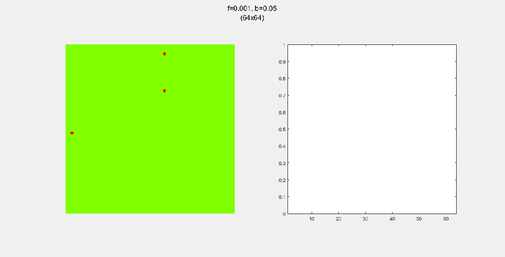
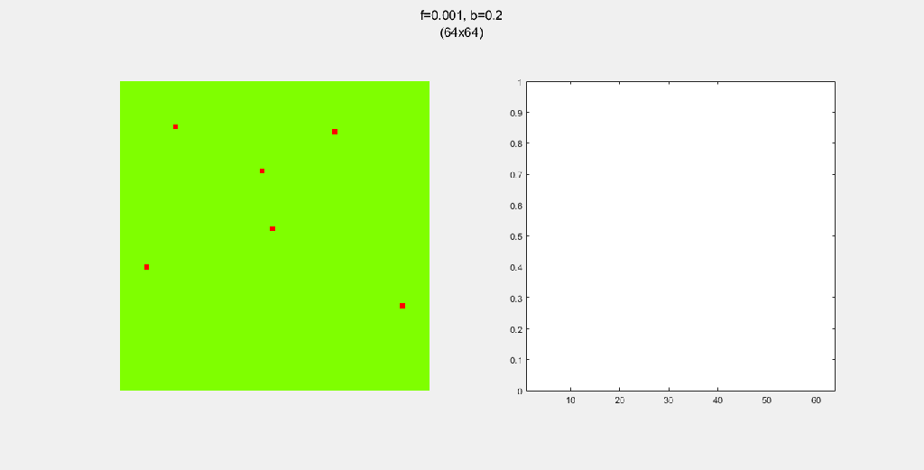
Each gif is composed to two parts: the grid on the left represents the forest, while the plot on the right represents the relative populations for each time step. In the grid, white cells are empty land, green cells are green trees, and red cells are burning trees. In the plot, the black/green/red lines correspond to empty land/green tree/burning tree, respectively.
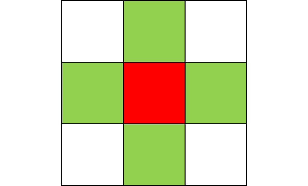
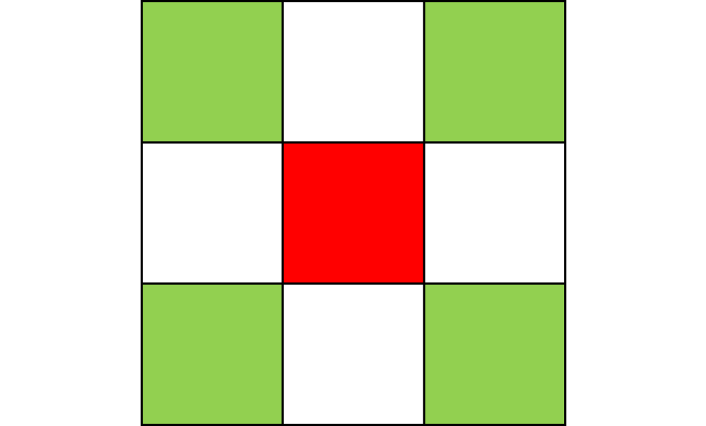
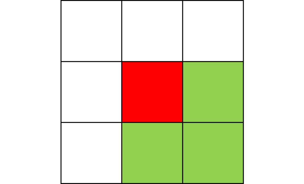
4-way spread pattern
Here, I used a 4-way spread pattern, meaning that any green tree to the left, right, up and down of a burning tree becomes a burning tree at the next time step. The patterns produced spread in a diamond-like pattern. I also noticed that the relative populations appear to oscillate over time. This makes sense to me since more land -> more green trees -> higher chance of a fire starting -> decrease in green trees in the next time step. A higher value of f also increased the initial spread of the fire.


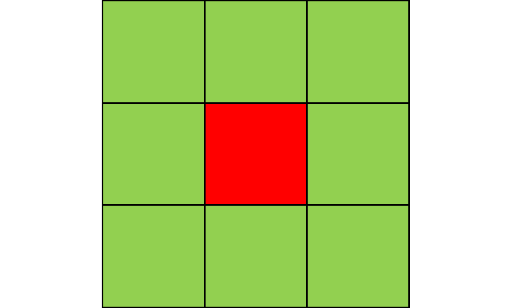
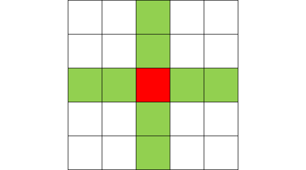
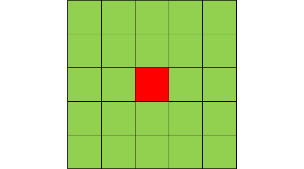
8-way spread pattern
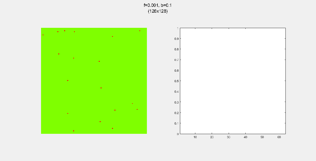
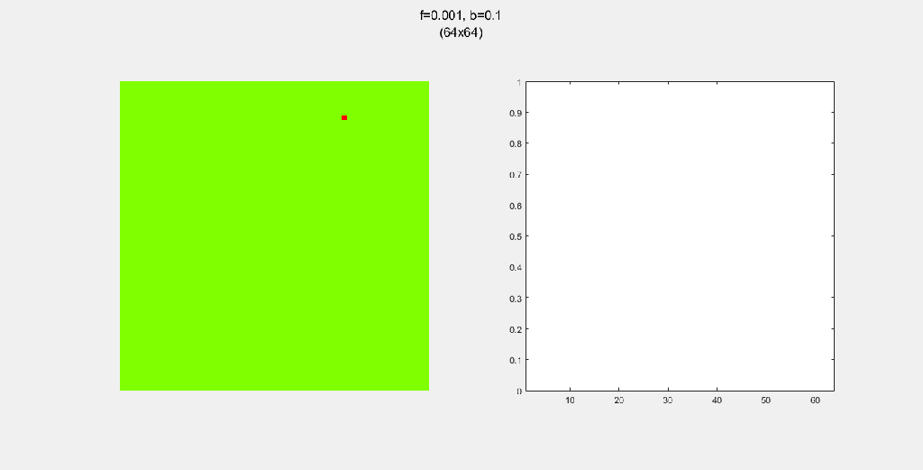
For this one, I used an 8-way spread pattern, which is just like the 4-way spread pattern, but including the diagonals. The three GIFs have the same f and b, for different values of N. As opposed to the 4-way spread pattern, the fire spreads in rectangular patterns.

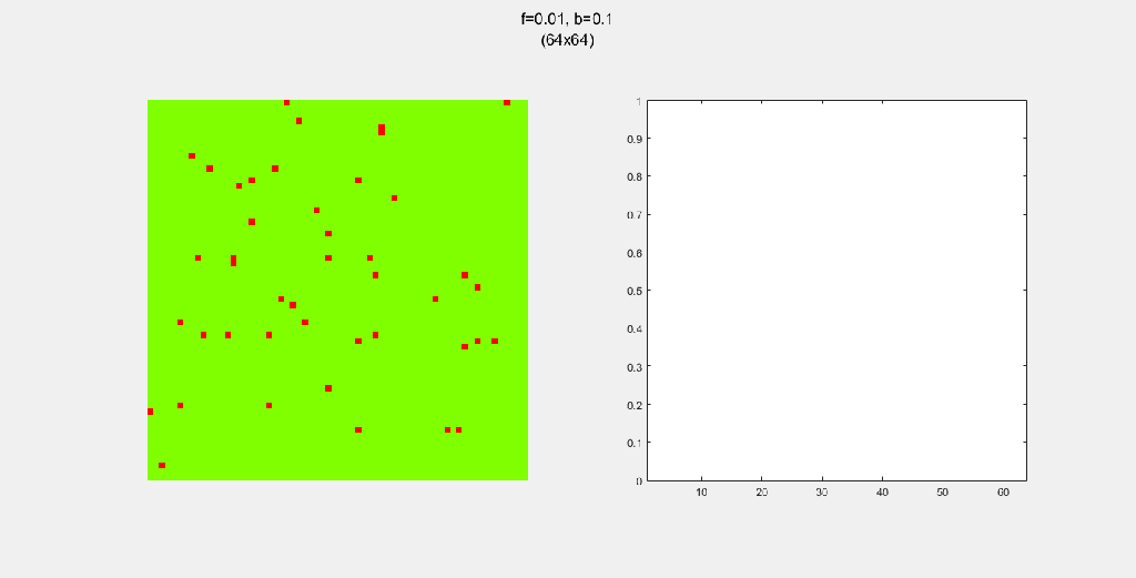
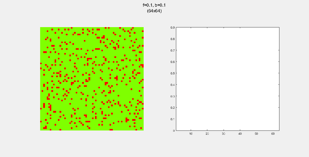
Playing with fire (probability)
All parameters were held constant here except the fire probability f. Increasing f increased the rate of change/oscillation of the system.

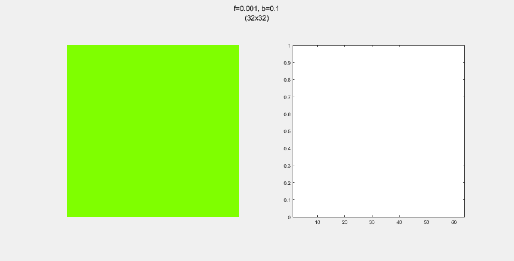
Importance of tree-planting
Setting b to zero quickly leads to a wasteful GIF (since nothing happens after a while). I found it interesting that increasing b led to a more chaotic behavior, since fires have longer lifetimes due to the presence of more trees/fuel.

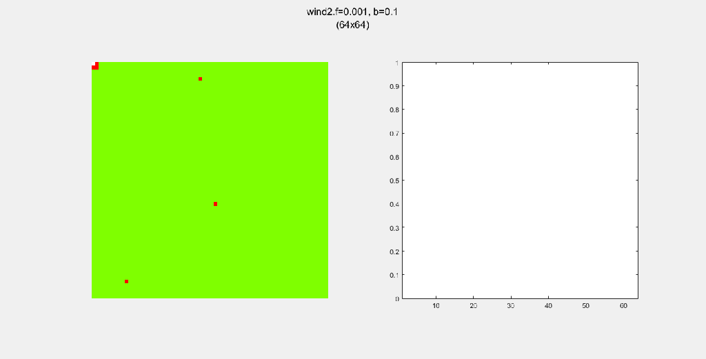
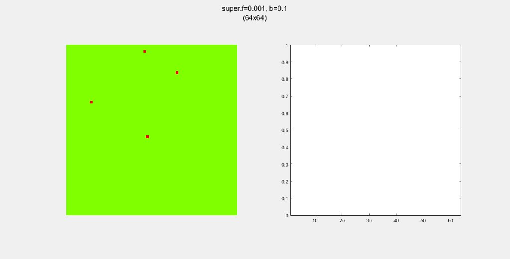
Miscellanous Patterns
Here, I tried out various spreading patterns. Namely, I used X, wind, bomberman and superspread patterns. The specific spread patterns used and their CA results are found below

Conclusion
With just a few parameter changes, and some simple rules, I was able to produce a great many interesting patterns. I feel as though I have only just skimmed the surface of CA systems. All in all, I had a lot of fun coding this and coming up with the various scenarios.
A possible forward direction for this system is to encode the time it takes for a tree to grow. That is, to delay the “birth” of the trees, as opposed to the instant growth I used for this project. Another would be to include water sources that quench fires that come near them.
Reference
This project on the forest fire was based on the description and suggested parameters found in “Cellular Automata: Simulations Using Matlab” by Stavros Athanassopoulos, Christos Kaklamanis, Gerasimos Kalfoutzos and Evi Papaioannou.