Aperture-Generation using MATLAB

Greetings!

For the second activity of Applied Physics 187, we were tasked to generate different grayscale shapes using scilab, octave or MATLAB. I chose MATLAB because I was more familiar with it. In this blog, I’ll explain how my code works, and the shapes they produced.

Initial Parameters

initialparameters

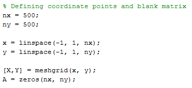
This first piece of code outputs two things: (1) the matrix A filled with 0’s of size (nx, ny) that shall act as the container for the shapes to be produced and (2) the 2D cartesian coordinates from -1 to 1 represented by the X and Y matrices. The vectors x and y represent the x and y coordinate axes. From this, ‘meshgrid’ generates the matrices X and Y, which contain the x and y coordinates for the 2D region (i.e. points off-axis). X and make operations over x and y easier. In essence, andwill determine the conditions for the shapes, while A will be the “canvas” for the shapes. Note that for each point in or Y, there is a corresponding point in A.

Displaying

The values of A are changed depending on the values of X and depending on the desired shape. The next portions describe how to obtain the desired shape in code. The images are then displayed and saved using the following code, where I used ‘export_fig’, a function made and shared by Yair Altman on MATLAB’s File Exchange.

addpath

Plotting

Centered Circle

circlecode

The first shape is a centered circular aperture. A matrix r is made, which contains the radial distance of the points from (0,0). The next line finds points in A with corresponding r <0.7, and changes their values from 0 to 1. The result is a circle centered at the origin with radius 0.7.

circle

Centered Square

squarecode

The second shape is a square centered at the origin. I first defined the “apothem”, which is defined as the shortest distance from the center to the side of a regular polygon. It’s kind of like the radius of a circle. Next, I found points whose and Y coordinates are both less than the apothem, and changed their values in A to 1.

Also, I would like to acknowledge and thank Martin Bartolome for teaching me the usage of the & symbol, which is very useful in shortening codes.

square

Sine wave along x

sinexcode

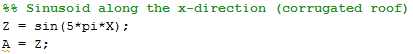
In the previous shapes, the binary shapes were produced by making the values of A only 0’s and 1’s. The next shape, the sine wave, is not binary, but has a gradient of values. To do this, the values of X (since we want the sine to  vary along this direction) were inputted into a sine function. The nice thing about using meshgrid to get and Y is that performing operations is very similar to how we do it by hand, as in this case. The image below is the sine wave viewed from above (looks like a corrugated sheet of metal). The constant multiplied to X controls the frequency and period of the sine wave.

sinex

Grating along the x-direction

gratingxcode

This shape is very similar to the previous one, but instead of using a sine wave, I used a square wave. The variable m controls how many bars there are.

gratingx

Annulus

annulus code

The annulus, or donut, is very similar to the circle. The first step is to make a circle with radius R_out. After that, a circle of radius R_in is deleted (by making the values 0). The result is as follows.

annulus

Centered circle with a gaussian gradient

Gausscode

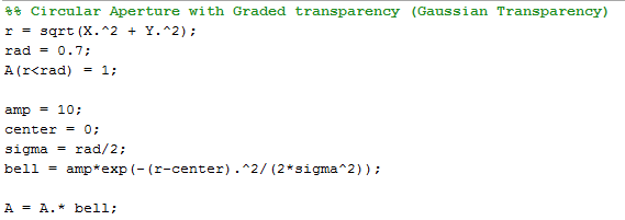
This shape is similar to the centered circle, but instead of having a value of 1, the values of the circle must have a Gaussian distribution. I accomplished this by making bell, a 2D Gaussian bell curve centered at the origin that has the same size as A, which will act as a Gaussian filter. I “filtered” A by performing item-by-item multiplication of and bell. The parameters amp, center and sigma control the height, location and spread of the gaussian bell curve.

gauss

Ellipse (with rotating capabilities)

ellipsecode

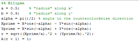
I enjoyed working out this shape, just because I had to derive the method to rotate the coordinate axes (because I miss Math). Anyway, the variables and correspond to the maximum length of the ellipse along the x and y axis, respectively. The x and y axes can be rotated by an angle alpha in the CCW direction using the rotation matrix of cosines and sines, the rotated axes being denoted by Xprime and Yprime. The following images show the ellipse rotated 0, 45 and 90 degrees in the CCW direction.

Ellipses

Cross

crosscode

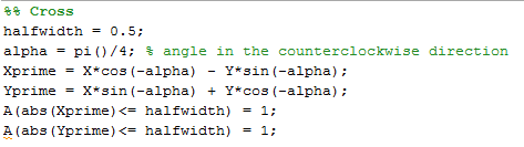
Since I had fun rotating the ellipse earlier, I ended up rotating the cross as well. The variable halfwidth, as its name implies, determines half the width of an arm of the cross.  The cross is very similar to the square, but instead of finding points that whose and Y coordinates are within a certain region, the cross is done by finding points whose X OR Y coordinate is within a certain region. The OR can be done by using | instead of &.
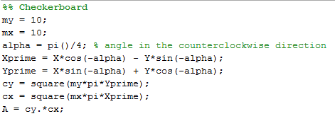
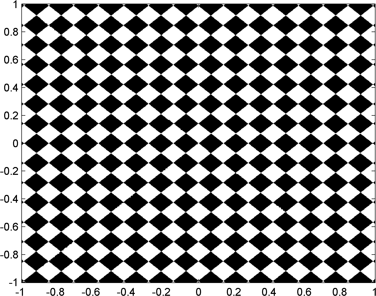
cross0cross


Checkerboard


checkerboardcode

This next shape was not required, but I did it because I found this activity extremely enjoyable, since I love coding. It’s a checkerboard, which is based on the grating. This was accomplished by making two perpendicular gratings (one along x and the other along y), and simply multiplying them term-by-term. The only portions that will remain are the intersections of the two gratings.

checkerboard

For this activity, I’d grade myself a 9/10. For while I enjoyed the activity and finished it relatively early (even having the time to make other shapes), I still made the blog very late.    All in all, I hope this activity will still be done for the next batches.


How to digitally scan a line plot (with pictures)

Greetings everyone! My name is Mario and this is my first blog for this website. This blog was created for my Applied Physics 186 course under Dr. Maricor Soriano, and since I haven’t blogged for a while (not since 2011), I’m not really sure if I’m more excited or worried. I’ll just see as I write in this blog.

Our second activity (first for the blog) for the AP 186 course is to digitally scan a line plot. This means that we convert a scan of a line plot, which is composed of pixels, into meaningful physical variables. In other words, we are attempting to retrieve the actual data from a picture of the graph of the data.

I. Finding a hand drawn graph

Since this is only the second activity, we started out with something simple for the plot. The graph should only contain one plot, so as to remove confusion from many plots. Also, the plot must be from an old thesis or dissertation, old enough that the plot is drawn by hand or by an xy-plotter, to  remove the chance that the actual data is easily accessible.

After a quick search in my research laboratory’s library, I found a suitable graph from Ms. Linda Posada’s thesis from 1986, entitled “Modulation Characteristics of Bundle-Integrated-Guide Dynamic Single Mode (BIG-DSM) Semiconductor Lasers.”

Scan of the hand drawn plot as well as the cover of Dr. Linda Posadas' thesis that it was found in.
Scan of the hand drawn plot as well as the cover of Dr. Linda Posadas’ thesis that it was found in.

II. Conversion Factor

So the problem is – how do we extract or retrieve the actual values of the graph using this scan composed of pixels? In other words, how do we convert the pixel coordinates of a point on the graph into its meaningful physical values? Lucky for us, this graph has equally spaced tick marks; this means that the location of a point measured from the origin of the graph is directly related to the physical value of the point. This would not be the case if the tick marks were in log scale, as the location would be non-linearly related. This key property is depicted below.

Importance of equally spaced tick marks

The physical values of points A and B can easily be obtained since they are aligned with the tick marks. But what about point C that is located between tick marks? For the case of equally spaced tick marks, it can be inferred that since point C is farther by a factor of 2.5 than A, C is located roughly at 2.5*1 or simply 2.5. But for the case of a log scale, this reasoning would lead to a value of 2.5*10 = 25 if we use A as a reference, or 0.25*100 if we use B. In both cases, we obtain 25, which is obviously wrong since it should be greater than 100.

The method used above is called Ratio and Proportions, and is an excellent way to estimate the physical values of points that are between tick marks. The method works by deriving a conversion factor from a point with known values. In our case, we will derive a conversion factor from pixel coordinates to physical values using the origin and tick marks as reference. We count the number of pixels between all tick marks, and average, to get the conversion factor. This is to be done for the horizontal and vertical tick marks. The respective conversion factors I obtained are roughly 39.5 pixel/horizontal unit and 125.4 pixels/vertical unit. (The decimals are due to the averaging process.)

III. Plot Reconstruction

Equations to convert pixel coordinates to meaningful variables were obtained from the conversion factors (CF). These equations are namely:

x,y are meaningful physical values subscript 'pix' indicates pixel coordinates subscript 'o' indicates origin of the graph
x,y are meaningful physical values
subscript ‘pix’ indicates pixel coordinates
subscript ‘o’ indicates origin of the graph

Thus, to reconstruct the graph, I manually determined the pixel coordinates of various points along the plot using MS Paint. I also determined the pixel coordinates of the origin of the graph. Using this data, I used the equations above to determine the meaningful physical values.

To check the validity of the results, I plotted the physical values I calculated and connected the points smoothly using MS Excel. I then used the original image as the chart background and adjusted the size. A nice fit between the reconstructed graph and the original image means that the physical values obtained are accurate. Below is the picture of the overlaid graphs.

Calculated physical values overlaid the image.

A good fit is observed, showing that the reconstruction is valid.

IV. Limitations of the Ratio and Proportion technique

As I performed the activity, I noticed some limitations. Firstly, it is very important that the axes of the graph are as horizontal and vertical as possible (i.e. aligned with the edges of the image), so as to simplify the conversion equation. It can still be compensated however by transforming to a rotated pixel coordinate system.

Secondly, it is very important that the tick marks are equally spaced. This simplifies the conversion into just a scaling problem, which is easily performed using just excel.

Lastly, a better fit is obtained if the pixel coordinates obtained from the curve are not equally spaced. That is, the sharper the curve, or the more rapidly the curve changes, the more points must be taken. Taking equally spaced points would result in the following reconstruction:

Overlaid2

It can be observed that the reconstruction is somewhat lacking for the sharp curves.

Thus, to get a good reconstruction, great care must be taken in making the axes square with the image, and many points must be taken to get a good reconstruction. All in all, the work is quite tedious, but I still had fun in doing this activity. Would be nice to semi-automate the process though.